

5 Essential Design Principles If You Are Not a Designer but Have to Design Something
Like Joe Sparano once said, ‘good design is obvious, great design is transparent.’ However, not all of the people working with project development have the knowledge to craft a design that is both intuitive and eye-pleasing.
Before presenting an application or service to a broader audience, project owners must have a working prototype showing the general idea and the key features.
So today, we are sharing five essential tips to help people not closely working with design create easy-to-understand user interface solutions.
Working with Visual Weight While Creating Designs
Visual weight is the notion that design elements have varied weights in design. Some objects, even on a two-dimensional medium, can appear heavier than others. Visual weight is a powerful concept, allowing project owners to form a visual hierarchy, symmetry, balance, and harmony in designs. When applied strategically, weight can help to guide the viewer’s attention through the desired flows.
The concept pivots around the idea that distinct elements in a design have varying heaviness relative to each other. It is diligently tied to symmetry, helping to accomplish symmetry and balance in various UI and UX designs, to make objects appear equal in visual weight.
Right Color Is the Key
Colors are a way of generating emotions and a chance to interact with users. When designing an engaging user interface, color is one of the most important aspects. Understanding color theory can be a challenging and sometimes even overwhelming experience. Still, when used in the right context, colors can enhance the overall experience and improve the conversion, whether it’s an application or a website.
Chief Technology Officer Alex Sipkevich said, ‘Color can either improve or worsen the design. Never force a user to strain their eyes to read. Don’t use similar colors for text and background or overlapping elements. Don’t choose grey on light grey or red on pink. Bring contrast to your design.’
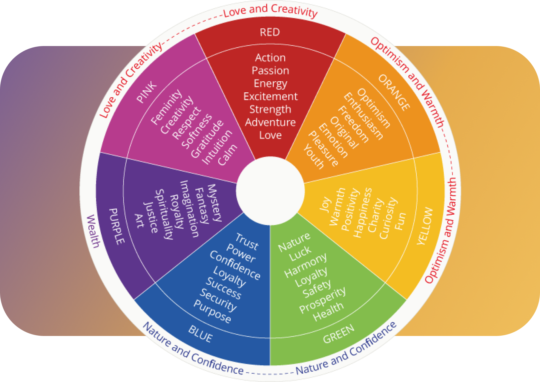
People working on designing the next great thing can use websites like WebAIM or Colour Contrast to get color combinations that create synthesis in the overall design.
Mind the Size of Your Designs
Higher density or also known as size drives efficiency. The density is crucial if project owners design interfaces meant to be used frequently. A correct choice of block sizes, headlines, and other website or application elements allow to work easier and navigate with different elements without a hassle.
Achieving consistent size across all elements requires a few steps — establishing a scale, identifying atomic components, determining a target height, and tuning properties per component to achieve that height.
For some projects, the formula ‘one size fits all’ works best. However, if you are creating a project far more complex than two buttons and a headline, you might want to bring different sizes that would not interrupt one another. When you want to achieve a seamless experience through the whole design, use these three density rules:
- Small-density displays for frequently used interfaces that integrate large data and enable diverse tasks.
- Medium density is a default for many motifs and long-form reading experiences for the consumer, business, internal apps, and various content pieces.
- High-density content-rich marketing sites use large-density, promotions and one-time data entry for onboarding, setup, and other simple flows to capture the user’s attention for a short period.
Incorporating Style into the Project
What most people recognize as a ‘design style’ is a set of particular color harmonies, typefaces, compositional styles, and other elements. However, on a higher level, design styles usually carry certain principles of what the goals of design are and techniques that help to accomplish those goals.
Style brings uniformity of expression. It allows users to separate your project from the competitors, and if done correctly, it can even help the target audience to choose you over similar projects.
It is important to think about the style of a business card — will the chosen elements make the person to whom you handed the business card convince them to reach out?
Think About the User While Designing
The same would go for everything intended to be released to the user. Whether it’s a copy, a website, an application, or even a Social Media post, ask yourself a question — ‘does this makes sense?’. Will it make their lives easier, and does the project solve any of the pain points the target audience has?
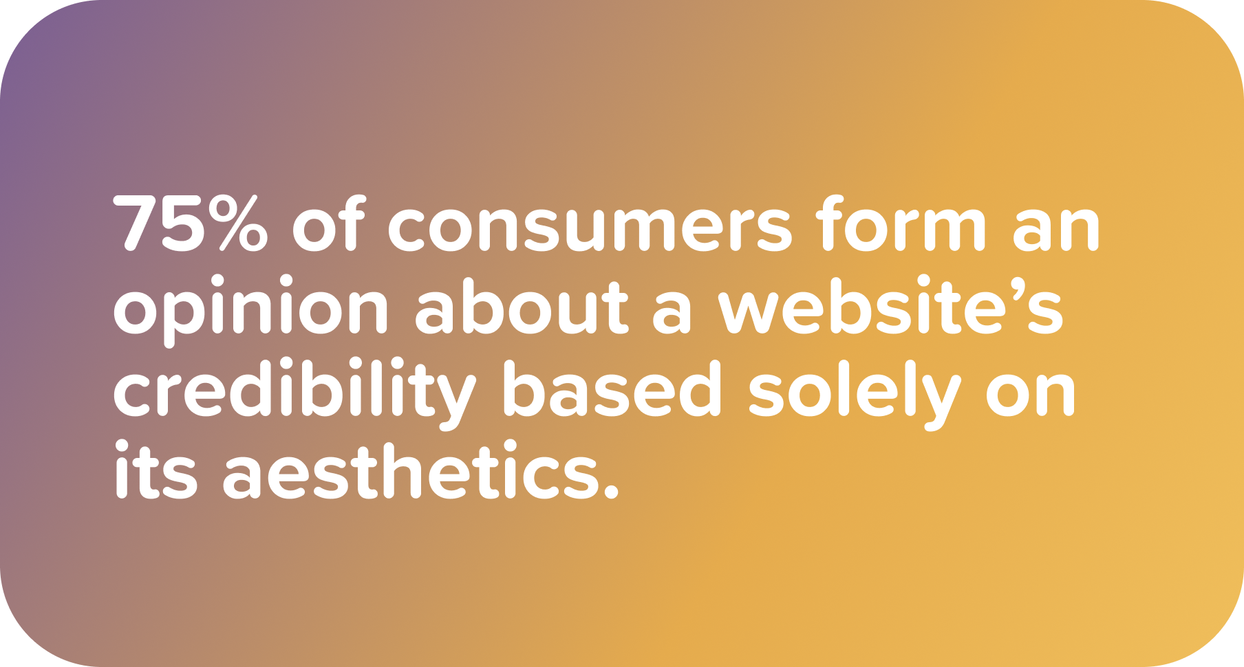
If you feel any negative emotions after viewing your final work — there is a high possibility that the user will feel those emotions too. The publication on ResearchGate shows that 72% of users will not use the interface if it has any design flaws.
If there is a lot of noise, try to simplify the design, cut the headlines or features that would not benefit the end user. On the other hand, if crucial elements are missing or the headlines are not capturing the attention enough, don’t try to search for workarounds! Before the release, tweak the project before the release.
Bottom Line
Be innovative. Surprise yourself. Surprise others. Strive to disrupt the industry and provide solutions instead of focusing on marketing. Let your design be adaptive and reactive to the situation. Investigate different design styles, sizes, colors, and weights, adopt them, appreciate them, and utilize them. Enhance the expressivity and effectiveness of the project to bring the next big thing.
Enjoyed the article? Follow us on Twitter for more great reads, and keep updated with the latest news from Joiner.
© Articles are available for media/public use though, if you use an entire or part article, please include a link to our site.